Team Size: 4 | Project Duration: 1 week | Role: UX Designer & Writer
Possible Use Cases:
High fidelity prototypes could be used for a new internship application service.
Tools Used:

This group project was assigned in my Interface Design II class. In both Interface Design I & II, we were taught how to use Adobe XD to create wireframes and prototypes. We also learned information architecture and the principles of interface design. Most importantly we learned the different interface design patterns and how to optimally use them to organize the content on a page. We spent the term analyzing websites, specifically internship application services, on how they organize their content and how this impacts the users. We also analyzed the strengths and weaknesses of their interfaces in regard to workflow and user experience. By the time this project was assigned we were quite familiar with the internship application service market.


For our final project, my project team was assigned to create a new internship application service. With the knowledge gained from our competitor analyses, we had to create a new competitor to Indeed or LinkedIn. We had to design high-fidelity prototypes for both a website and mobile version of our new internship application service. The goal of the project was to properly implement the interface design patterns we had learned to create a user-friendly product. Finally, we were also tasked with writing a report detailing our design rationale. Due to our class falling behind schedule, we were only given one week to complete the project instead of the planned two to three weeks.
My team realized we had a time constraint, and decided to set and limit our scope first. User research was our first concern. My team knew we did not have enough time to send out surveys and wait for responses or conduct a case study. Instead, we opted to each interview three college students, for a total sample of 12, about their experience using internship application services, their favorite features, and what features they would like to see implemented. From this research and the competitor analyses we had previously done in the course, we came up with a list of needed features for our application. Finally, we decided we would not be able to complete any user testing of our prototype. This would again take up the time we did not have.
The college students we interviewed made it clear that they wanted a simple way to filter and search for internships. They also wanted to have a profile where they could showcase their skills to recruiters. Students also wanted the application process to be entirely within this service. Many competitors have you find internships on their website and then go to a different one to apply. This makes it difficult to fill out many applications quickly since presets are not saved and you have to enter your information at each new site. They also mentioned they disliked how much they had to move between different tabs and windows. With these changes in mind, we knew what we needed to include and where to make the user's experience more seamless.
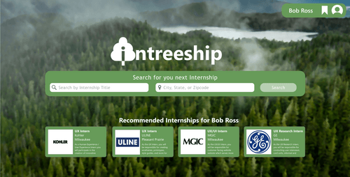
We started our process by creating a brand with a strong identity that would make our site stand out and be appealing to use. We knew that applying for internships can be a daunting task. We wanted our brand identity to be warm and inviting and to have our site follow the theme. A Swedish team member suggested the idea of incorporating Scandinavian minimalism into our brand identity and application. Scandinavian minimalism is characterized by simple, clean lines and functionality with a focus on comfort and coziness in designs. We choose a tree and forest theme because trees represent life, growth, and prosperity. We decided to use the backdrop of a pristine forest with a green and white color scheme for our site. Green and white are colors associated with happiness, comfort, and safety in Western cultures and therefore the ideal choice to make our application feel safe and comforting. Finally, we made our icon a fluffy tree with an "i" in it to keep with the simplicity and comfort of our application.

Next up we had to decide on our information architecture. We had to display all the content required of an internship application service while still including the features that our users wanted. We narrowed down the interface design patterns we used below.
Once we decided on the interface design patterns and information hierarchy we began designing the prototypes. Due to the time constraints and group size, we decided to work on both prototypes simultaneously. We split up the work between the four of us and helped each other when needed. I designed the job application window on the desktop version, the profile page, and assisted on various smaller tasks. My team frequently revised changes to keep the experience of the two platforms as close as possible.
Once we all completed our work, we reviewed the work as a group. We made changes as necessary and made sure everything conformed with the brand identity and theme. Once we approved our prototypes, we turned them into high-fidelity prototypes. We created user flows in Adobe XD and linked the pages together. We then tested the user flows to ensure all objects and pages were linked to the proper navigation.

We faced serious time constraints. We were given a week to create a functional high-fidelity prototype and design rationale from scratch. The one-week timeframe was not intentional. Our professor had intended to give us 2-3 weeks to complete the project; however, the course fell behind schedule. With busy conflicting schedules, we had to use our time efficiently. Due to the shorter time frame, we had to narrow our scope. Ideally, we would have spent more time with user research. This also prevented us from conducting user testing on our prototype. We had to design based on informal research collected from a small sample size of college students. My team also faced issues designing on two platforms at once. Work had to be divided and revisions had to be constantly made to maintain consistency. We wanted to ensure that the experience was familiar and positive on both PC and mobile versions.

For our final prototype, we implemented all the needed features in our design approach. We also combined many of the best features from our competitors to create an ideal product. Our service allowed students to filter internships based on many different factors including company type and whether it was paid or unpaid. Also when searching and filtering, all the company info will show up for each search result. This way you do not need to jump to a new page to look at basic information about the filtered company.
For our application process, we ensured that each step of the process was tracked and saved so applicants could end at any step and resume at any point. We made navigation back and forth simple so applicants could go back and make changes if need be. Finally, on the last step of the application, all previous information is shown and can be edited on that page itself. This reduces the amount of page shifting the user must do. We combined all this with a feature to save internships. This ensures safe navigation through our site and helps prospective memory.
Finally, we included user profiles. Many of the college students we surveyed said they liked having a user profile similar to LinkedIn. We decided to implement a full user profile that can include links to other media and a portfolio. The user profile can also have a pre-uploaded resume and an editable cover letter. This also allows users to automatically add that information into the application which saves time.
I learned how to implement design principles I learned in class to a simulated product. Here I gained experience implementing user feedback into designs. Up until this point I had mostly worked on smaller projects where I implemented solely my ideas. This was the first project where I worked on creating a product for two platforms simultaneously. I learned how to keep the same functionality but change the design choices to suit each platform. I also gained experience working in Adobe XD. I had previously only used Adobe XD for wireframing and prototyping. This was the first time I created a high-fidelity prototype in Adobe XD. Finally, I learned to excel in a very short sprint. My team and I had one week to create two high-fidelity prototypes along with an accompanying report. My team managed to complete the work and enjoyed designing such fun prototypes!